Client:
Firstsite
Date:
2020
Deliverables:
Design / Typography / Exhibition Design
Brief:
Plan, design and install vinyl typography for an exhibition at an art gallery in the heart of Colchester.

Problem

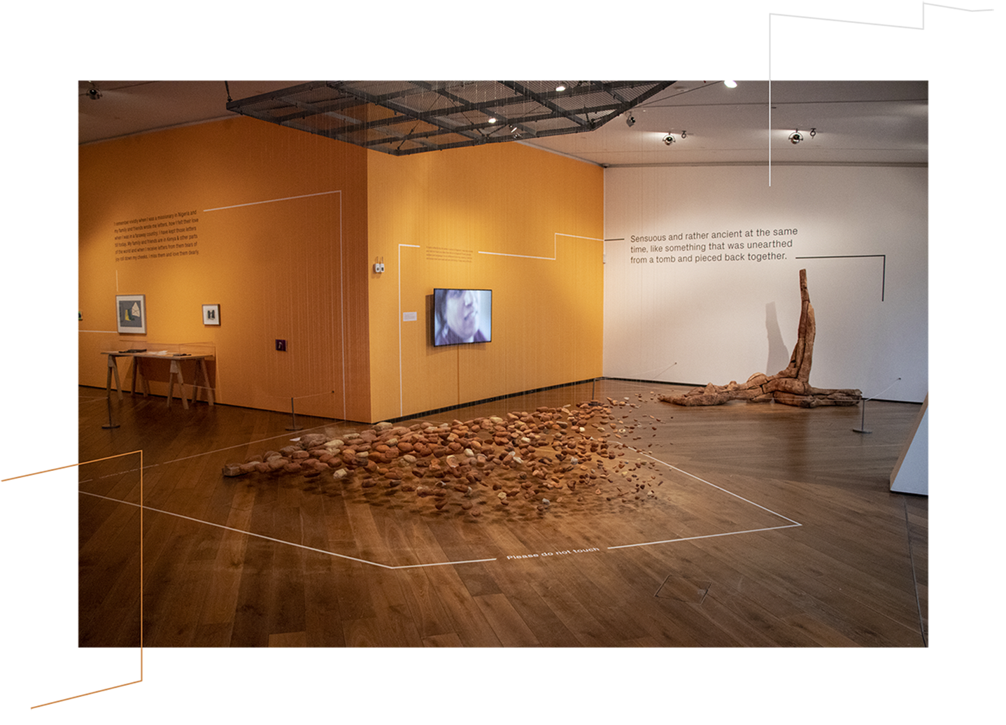
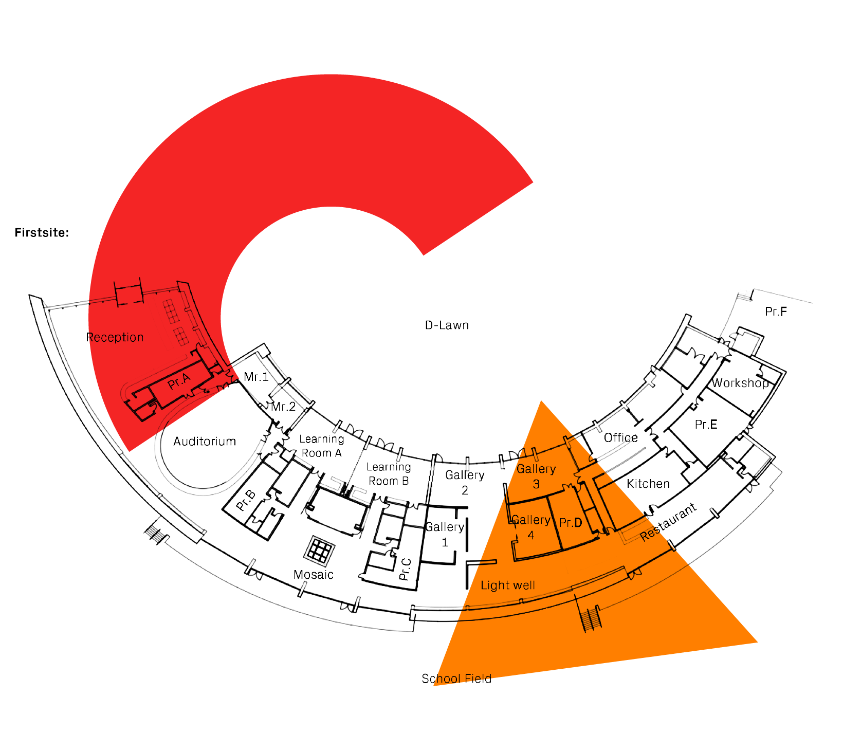
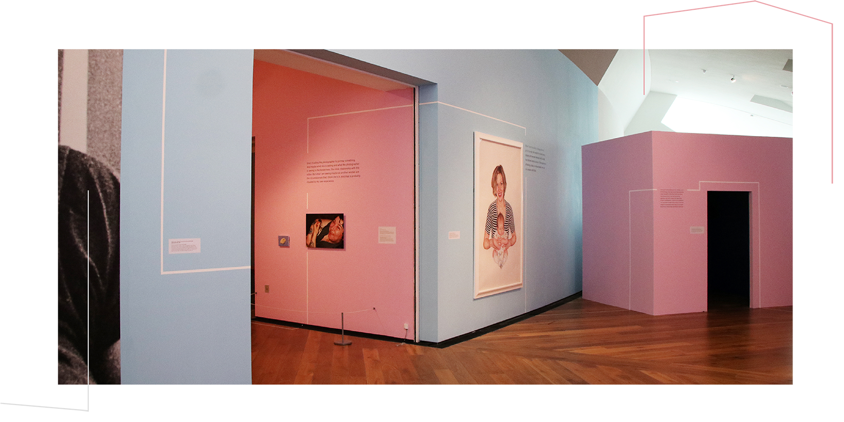
We were approached by the team at Firstsite, an art gallery in Colchester, with a unique project they wanted our design knowledge and help with. They had an exciting exhibition coming up which involved a series of quotes and descriptions to be printed on vinyl and displayed on the walls in the gallery, alongside the pieces of art. The exhibition itself was meticulously curated therefore it was our responsibility to balance the typography with this, as well as create something which was aesthetically pleasing to an audience. The exhibition ran across several rooms so as well as designing and positioning the type, we also had the idea to create a relaxed wayfinding system which would guide the audience through the exhibition. With this a narrative is carried along with the audience, enhancing the interpretations behind the curation of the exhibition as well as creating an ease of direction for the audience – keeping the gallery in a constant flow of people as they follow a simple, crisp white line

Challenges

This was a unique project and posed its challenges, due to the architecture of the building, no two walls are the same. This was achieved through thorough measurements and careful designing, every wall was created in 2D with all art positioned to the mm, then using the Firstsite brand typeface we began experimenting with size, line height, kerning, leading and so on until we found an equal balance between art and type. By far the most difficult of the walls was the mega wall, this is because not only is it over 17 meters long and 5 meters high but is also at an angle – which follows the angle of the entire building – meaning the way in which the audience views it needs to be taken into close consideration. This was also the first wall that you see when entering the exhibition, therefore first impressions needed to be good.

The Result

In the final parts of this project it was still very high stakes, it took a great deal of art direction for when the vinyl was printed and ready to be applied to the walls, it was important to keep the audience in mind and imagine how they would explore the space. How the typography would be seen and read is the most vital part of this entire project, if it is illegible then it becomes an unnecessary distraction. 

The end result is something we and our client, Firstsite, are very pleased with. The typography does as is intended and enhances the experience of the audience as well as taking them on a journey throughout the exhibition. The gallery itself is a unique and interesting piece of architecture and engineering, therefore the exhibitions inside should reflect this.

Want something like this?

If you’d like to work with us on your next bright idea, drop us a line…

Contact us Send us a brief