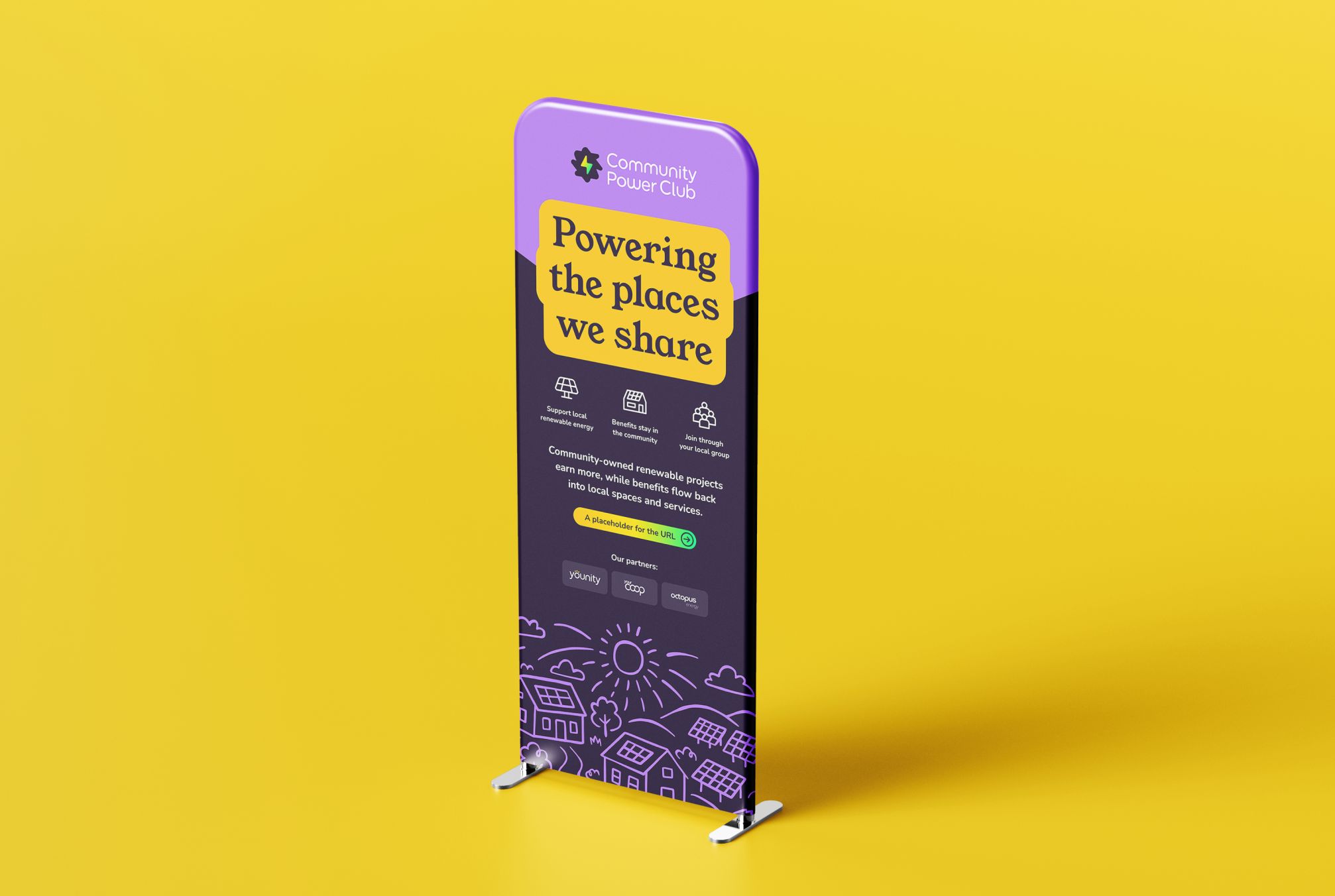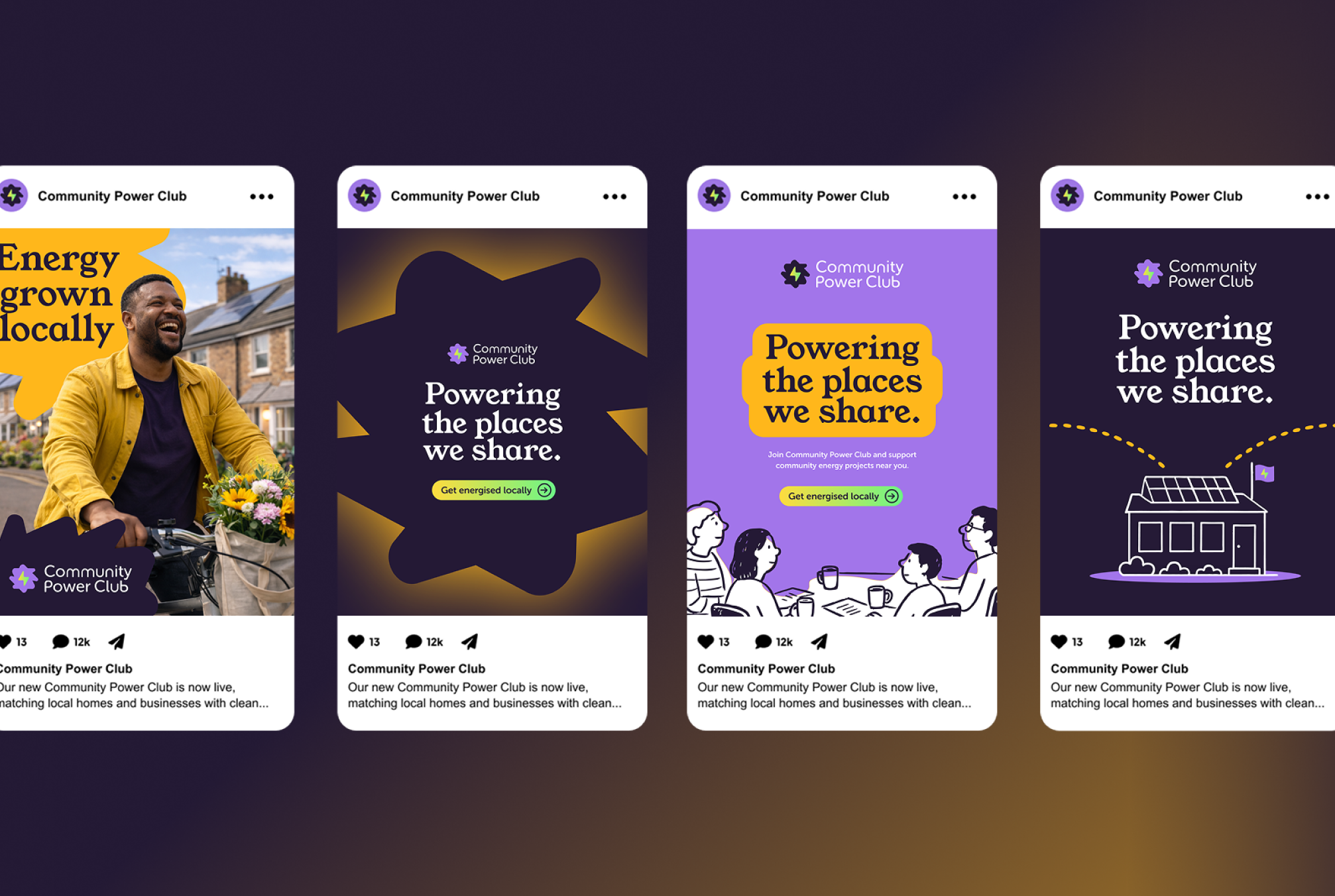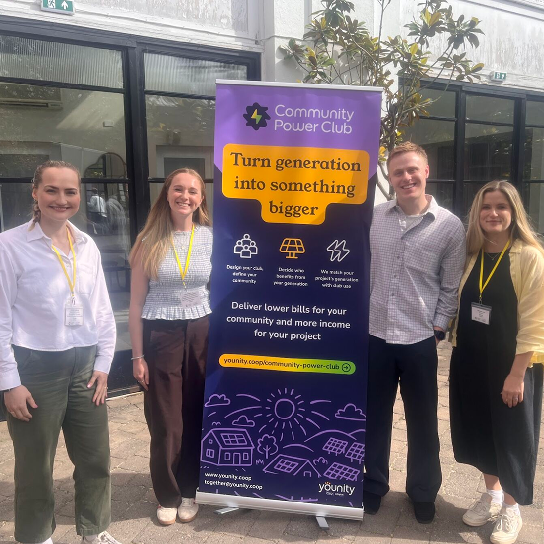

The primary goal was to create a clear, credible product identity that made community energy feel simple, local and welcoming, while remaining recognisably connected to Younity.
Community Power Club brings together community owned renewable energy projects and the people and businesses around them. The offer involved several audiences and a complex energy model, so the identity needed to communicate trust, local benefit and ease of participation without relying on technical language.
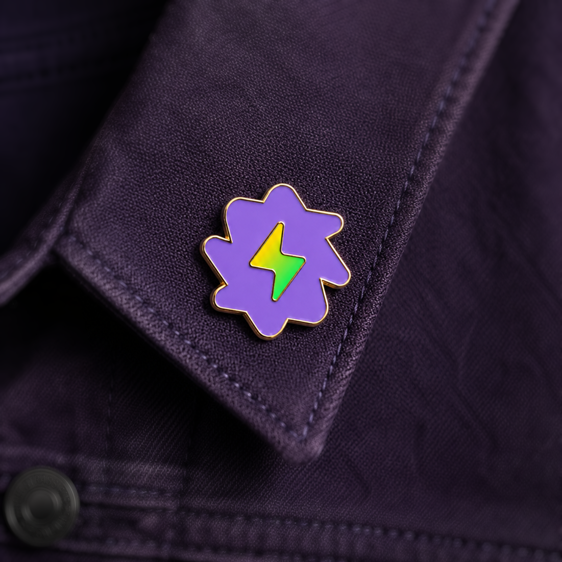
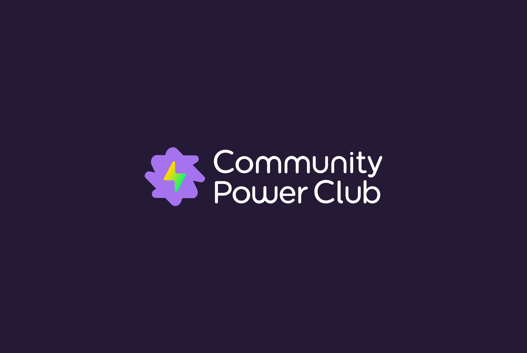
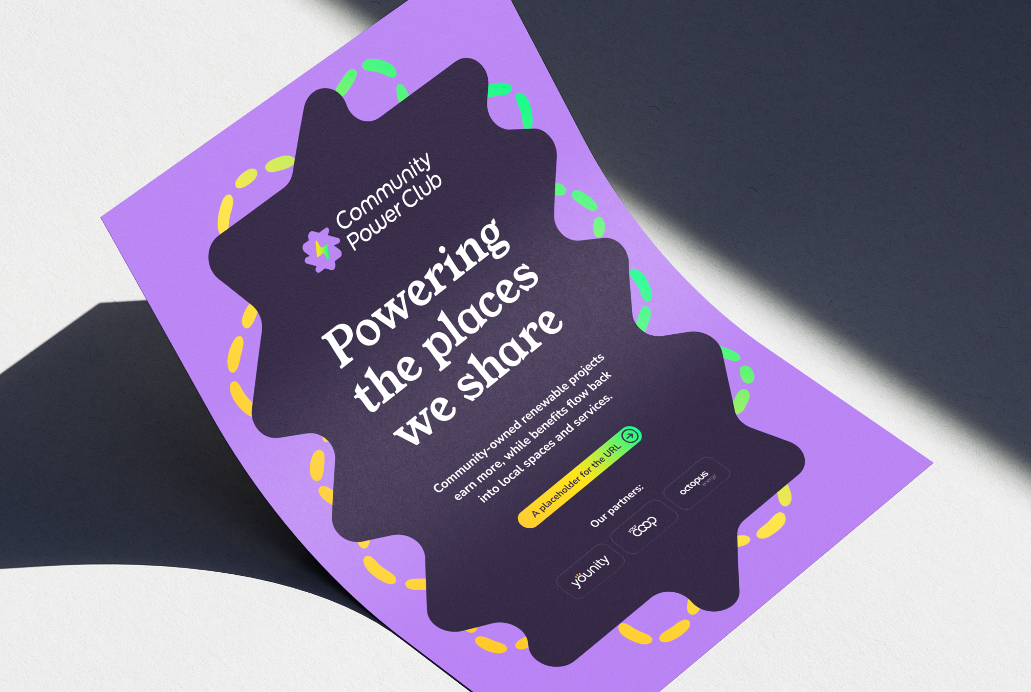
We worked closely with the Younity team to develop a distinctive sub brand with a clear relationship to its parent identity. The logo uses the same handmade typographic character as Younity, supported by a related colour palette and familiar rounded body typography. Community Power Club gains its own personality through its gradient energy bolt, characterful serif headlines, custom iconography, illustration style and brighter highlight colours.
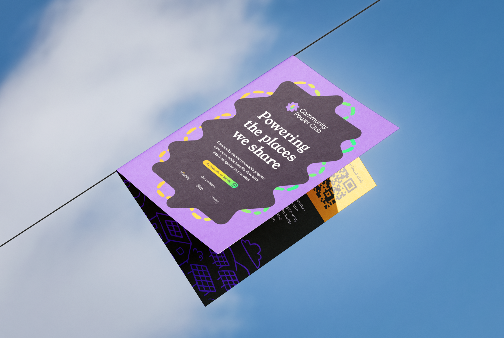
The completed toolkit included the logo system, a set of twelve icons, bespoke illustrations, social media templates, an email design, flyer and event banner. These practical assets give Younity and participating community energy groups a consistent system they can adapt across digital, print and campaign communications.
The result is an approachable and recognisable brand that helps make a complicated offer easier to understand, while giving Community Power Club enough independence to build awareness and recognition of its own.