What did we achieve?
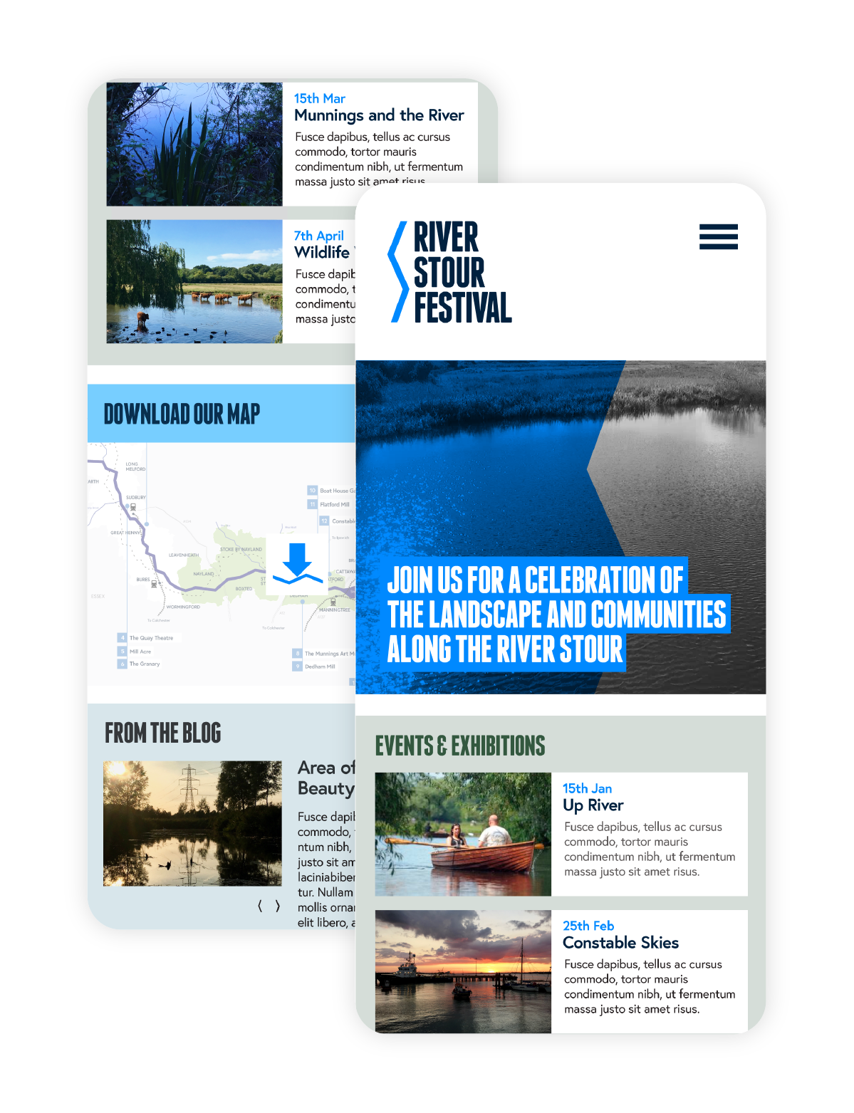
We created a fresh, contemporary identity for the festival that we felt appealed to a wide audience. Taking inspiration from the shape of the river we created a geometric brand mark to sit alongside the bold condensed type used in the wordmark, while using a limited colour palette to add impact.
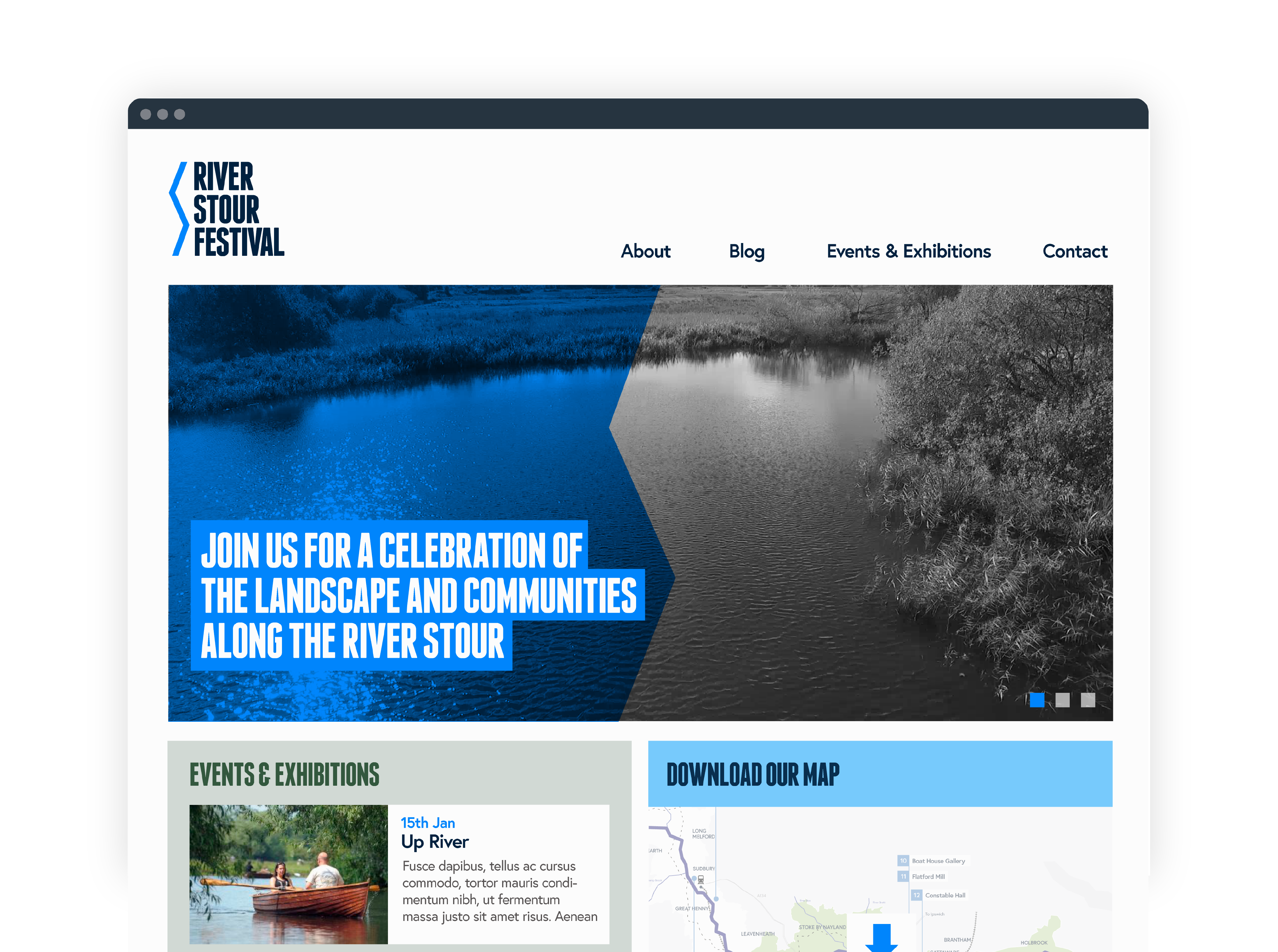
We also built an attractive, clean and very user-friendly website built in WordPress with a primary aim to showcase the festival events. The website incorporates a calendar of events in list style, using the WordPress CMS to allow staff to easily update content themselves. It was crucial for the client that staff would be able to add and amend events easily and efficiently, with there being a large number of events posted at any given time.
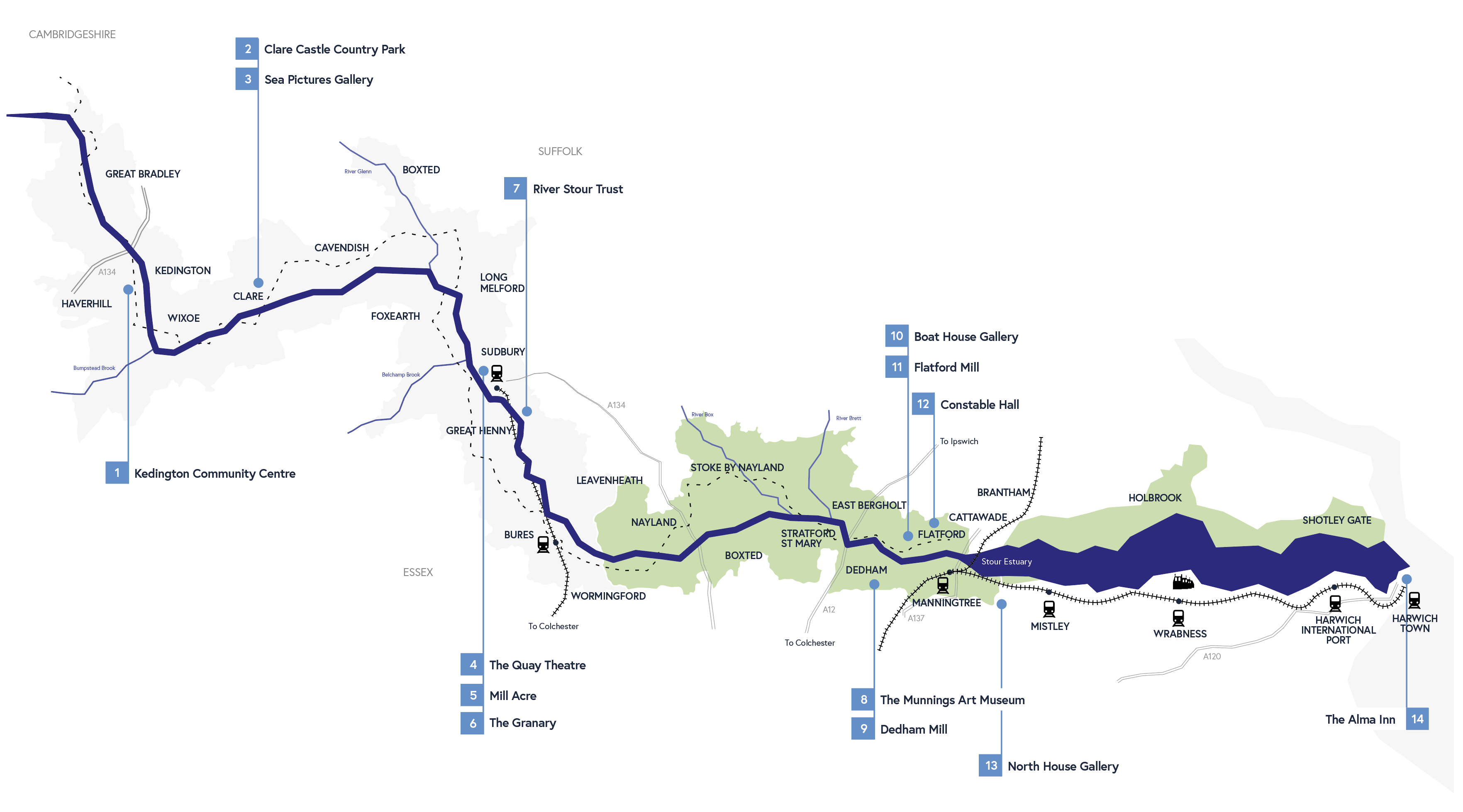
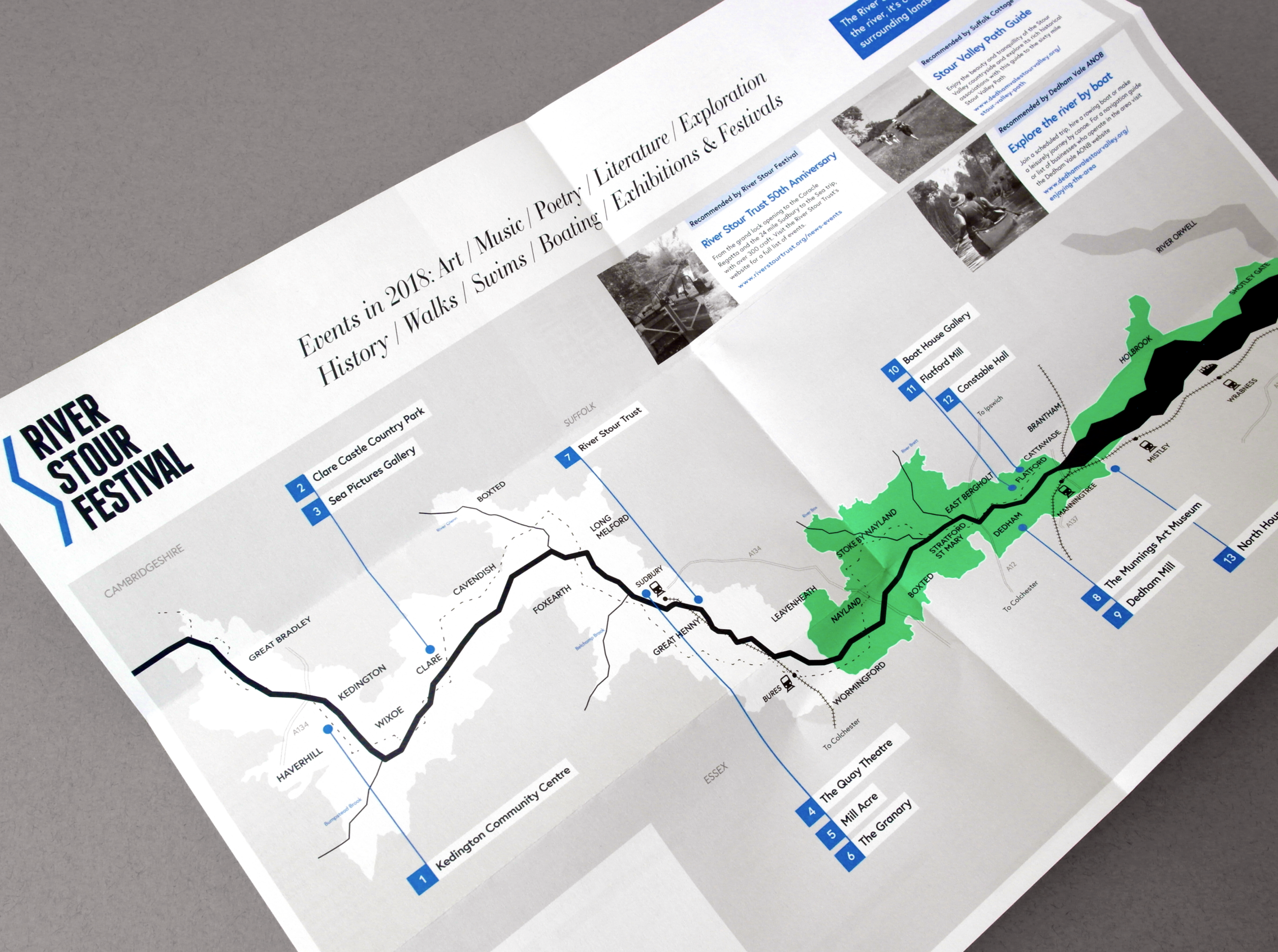
As well as the website we produced a fold-out wayfinding leaflet with an illustrated map signposting the event locations and travel routes as well as a tale of event listings. With a restricted print budget we used 2 pantones and black to achieve a striking brand style.
The client was pleased with the result and how easy the website was to manage, and visitors to the festival praised the design and print of the map leaflet.